Embedding Charts
The two charts embedded here use the vegaEmbed function to display real-time data visualizations. The first chart shows declining population trends across major developed nations, while the second tracks inflation rates for four G7 countries since 2000.
Unemployment Trends: USA vs France
I created two unemployment charts comparing the USA (1948-2025) and France (1975-2023) using the ECO Data Hub. Both visualizations pull real-time data from the ECO API and show how unemployment rates have evolved over decades, highlighting key economic events.
Wealth Inequality in Spain
Policy topic: Younger Spaniards accumulate less wealth than previous generations did at the same age.
Finding: Wealth declines for young households despite rising university education—suggesting education alone no longer guarantees wealth.
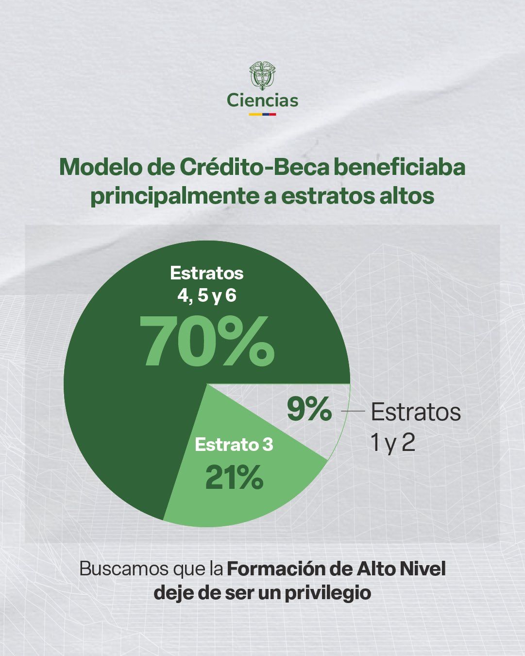
Redesigning a Misleading Chart
Context: In December 2025, Colombia's government cut funding to Colfuturo—a credit-scholarship program for graduate studies abroad. The Ministry of Science published a controversial pie chart to justify the decision.
What I did: Redesigned the misleading pie chart that grouped strata unfairly (4,5,6 as 70%). My bar chart separates all six strata, revealing Stratum 4 as the largest beneficiary (33%), not "high-income groups" as suggested.
Limitation: A fairer comparison would show Colfuturo recipients vs. university graduates by stratum—but this data wasn't publicly available.
Forest Loss in Latin America (Live API)
API Chart: This chart uses a live connection to the World Bank API. The base URL is https://api.worldbank.org/v2/, followed by: the country codes (COL, BRA, PER, BOL), the indicator code AG.LND.FRST.ZS (forest area as a percentage of land), format=json for the response format, date=1990:2022 for the year range, and per_page=500 to retrieve all records.
View full URL used →
Scraping
Scraping: Scraped Wikipedia's forest area table using pandas.read_html(). Filtered Latin American countries and exported to CSV. Challenge: handling multi-level column headers.
View Colab Notebook →
Unemployment Trends: Latin America
Using a Python loop, I batch downloaded unemployment data for 6 Latin American countries from the World Bank API.
View Colab Notebook →
Wales & Scotland Maps
I created two maps of the UK: a choropleth showing average disposable income by Local Authority in Wales using ONS data, and a coordinate map displaying waste disposal sites across Scotland with status indicators (Open, Closed, Disused) from UK Government data.
Extracting Stories from Millions of Prices
Using the AutoCPI database (6M+ observations), I analyzed olive oil prices across UK supermarkets. Chart 1 shows daily average prices trending upward from 2023-2025. Chart 2 reveals significant price variation between stores, with discount chains (Store 5) offering lower prices than premium retailers.
Mapping Violence and Environmental Impact
Context: Two interactive choropleth maps exploring the spatial relationship between armed conflict and environmental destruction in Colombia.
Left map: FARC conflict intensity (2001-2018) normalized by population, showing cases per 100,000 inhabitants. Data from SIEVCAC.
Right map: Annual deforestation patterns (2001-2024) at municipality level, measured in hectares lost. Data from Global Forest Watch.
Both maps include interactive year sliders to explore temporal changes and reveal patterns between conflict zones and forest loss.
Predicting Conflict & Deforestation Patterns
This challenge combines advanced visualization techniques with machine learning to analyze Colombian conflict and environmental data.
Part 1: Advanced Analytics - Diff-in-Diff Analysis
Analysis: Difference-in-differences comparing deforestation trends in high vs. low FARC presence municipalities before/after the 2016 peace agreement.
Finding: Municipalities with high FARC presence saw the largest post-2016 spike in deforestation, suggesting peace paradox.
Part 2: Machine Learning - Random Forest Prediction
Hypothesis: Conflict intensity predicts future deforestation rates in Colombian municipalities.
Method: Random Forest Regression (sklearn). Features: armed group conflict cases (FARC, ELN, AUC, dissidents), current deforestation, year. Target: next-year deforestation.
Finding: Model R² = 0.81. Current deforestation is the strongest predictor, followed by conflict intensity.
View Colab Notebook →